The Evolution of Evolution

North Star Games is a successful board game company that was eager to break into the digital market. For our first outing, we wanted to port the cult favorite Evolution. Creating a digital experience from any board game is a challenge, but the complexity of a board game in the Eurogame tradition has its own special challenges. For starters, this “board” game has no board! It has cards and chips and a “watering hole” to place the chips on, but the board is your table top. It was decided early on that, in the interest of full immersion, we didn’t want to show a literal “table top.” Instead of duplicating the aesthetic of a board game, which would reduce this digital game to a cheap facsimile of the “real” one, we wanted to exploit the digital medium to its fullest potential, which meant changing the aesthetic and user experience to one that befits the electronic medium. We had a set of high-level goals to guide us. One goal was to preserve the rules of the board game so this could be authentically “Evolution” – it has a preexisting fan base. However, a higher-level goal that trumped all was that rules could be massaged for a better player experience in the interactive medium.
In the summer of 2015, I set out to develop a playable prototype of Evolution with engineer Andrew Weiche and VP of Digital Scott Rencher. Within three months, we had a fully playable prototype and North Star Games' digital division was established. This game is slated for 2016.
The paper game looks like this:

First we needed an environment. There was no board, but gameplay centered around the watering hole, so this became the lynchpin of our game board.
Oftentimes I’ll try to get design dead-ends out of the way first, so my first crack was showing the game in a vertical alignment. On the iPad, this would make best use of two-player space, keeping the players’ “hands” at the logical bottom and top thirds of the screen. But very problematic if you go to four-player (and Evolution is most fun at four-player); and very very problematic if we eventually port to a horizontal platform such as console or PC – essentially the whole UI would need redesigned. For this reason, I knew this was a dead-end from the start, which is why I wanted to show this to my team first, to provoke the necessary discussion that would commit us to the horizontal format.

Players will take turns laying out species cards – mere spreadsheets in the paper version, but we needed them to actually feel like species for the digital presentation. Thus began the journey of developing the “species badge”, or visual representation of the species for gameplay. Since out game lacked player avatars, species badges would serve a similar purpose in our game: setting the context with visuals and animation; i.e. providing the flavor for the game.
Here’s the first pass in a horizontal HD format, introducing the species badges. All iterations henceforth would be in worst-case scenario; four players with late-game crowded screens. This was necessary to reserve the proper real estate for everything that would eventually need to share the screen.

New iteration in 4:3

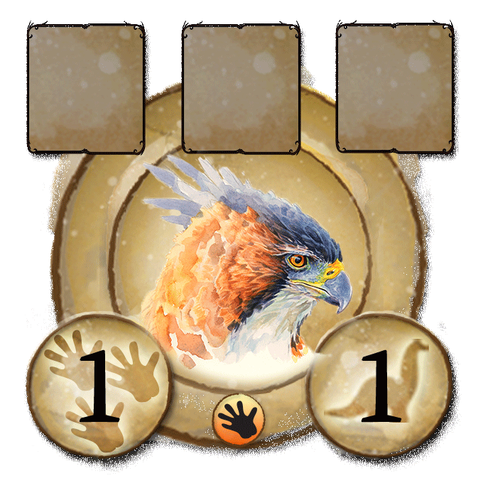
Another version showing a variation on the lower left species badge. The “pips” in the bottom pill represent the number of species; important during the feeding phase where you need to provide food in each of the empty pips or the species will die.

Close-up of the second version species badge

Another variation. There are two stat counters along the bottom, “population” and “body size.” I was using placeholder icons for them until we had the overall design worked out.

The next one is getting closer to final design. The trait cards in Evolution are fairly complex watercolor scenes that do not hold up at icon size. They are, however, finite in number and instantly recognizable to experienced players by their silhouette alone, which does hold up at icon size. Thus I made silhouette variations for each trait.

The game mechanic in the Eurogame tradition are very complex and don’t lend themselves well to the casual game market. Lots of information needs to be readily available, so we had to create an iconographic language to store vast amounts of information in a small space. To aid players through such complexity, we wanted to use the “live” medium of digital to prompt players to action. Here is an example of the pips pulsating a red color during the feeding phase; a subtle reminder that if you don’t feed them now, they will die at the end of the turn.

Here is what the same species would look like fully fed. Green works as a signifier because it has both “plant food” and “go” connotations, so a fully green creature would mean you can safely end your turn.

We iterated on the placement of all the visual data for maximum grok-ability, balancing visual harmony with accessibility and importance to gameplay.


The next two variations show the proposed difference between the main phase creature badge and the feeding phase creature badge; since you only interact with the pips during feeding phase, they only appear then. Number bubbles move up and pips cascade out of population bubble. Red pips turn green when food is dragged to badge. Number turns green when all red pips are turned green.


Another option would be for population to grow to a pill-shape for feeding phase. That’s not Braille, those are animal tracks.

Finally agreeing on a general direction for the species badge, matters of the overall playtable could again be addressed.

Now I began to concentrate on player actions and animated feedback. Players play trait cards onto a species badge. The following two images show the extents of the animation for dragging a card over one of the “drop zones” on the species badge. Everything with an outer glow is a possible drop zone for the card you are dragging. The card shrinks in size as you drag toward a drop zone.


This is a variation on the previous post; in this one, a darkening effect on the screen isolates the card and its active drop zone. It is suggested that the screen progressively darkens over the course of 2-3 seconds if the player hovers over the drop zone, to further clarify its active state.

Double-click a card (or middle-mouse-scroll) to get this fullscreen view of the species badge. Here, full cards appear instead of icons, and you get to name your species.

Another proposal for the fullscreen zoom. When you double-click or middle-mouse-scroll any game object (species badge, card, etc.) you get a fullscreen zoom. The rest of the screen darkens and blurs to keep foreground focus. The right side of the screen displays detailed information about the object, such as the active traits.

New version; nixed the maximum numbers ("6's") and blew up the trait cards to max size. Had to lose the info panel.

New version maximizing card size

New species badge. Trait icons bigger and color coded. New carnivore icon.

Option 2 - ring becomes red when species "goes carny." Species can turn into a carnivore with the addition of a carnivore trait. The red reminds other players that now this species can eat theirs.

Darkened the red a bit. Also, showing a possible subtle indicator for a "maxed out" attribute: the body size is at six, so its bubble has an additional highlight.

Another variation of a feeding phase badge. The population bubble morphs into a pill for placement of food in the food spots.

Here’s the default badge before any traits are assigned

Newer playtable layout. At this point all the assets were in-game and we had a playable prototype in Unity, less than a month into game design!

This version has the pips arranged radially so no morphing of the outer shape has to take place. In this example, the species has a population of three, two of which are fed.

This shows how the empty slot might highlight during your feeding turn. The concentric glow-rings would animate radially outward to catch your eye, indicating that this slot will be filled if you drag your species to the watering hole.

Here it is with "carnivore" food pips.

With Fat Tissue slots available. Fat Tissue is a trait that can store food based on body size, so we had to have the “body size” bubble also contain pips for this corner case.

New badge arrangement, maximizing population/body size and distributing traits evenly

Feeding phase variant, with pips. The new arrangement allows for trait arrows on either side of each trait slot. Some traits reference the trait card to the left or right of them – these “dependent” traits would have arrows as reminders.

Visualization of all badges during feeding phase.

Feeding phase option 2: only display pips when populated

Animated gif showing all the variations of food pips (maximum 6). This is not supposed to imply any sort of intro animation. This is just a comparison of the six possible states and how they affect the placement of the population and body size attribute buttons. For animation, we would have the food "roll out" from the population button but settle in the middle, as if gravity were affecting it, using Unity's built-in physics.
How this would look in context

For a cleaner look, we finally decided to get rid of the “population and “body size” icons, and rely instead on tooltips and tutorials to let players know what the two lower numbers meant.


Took a break from playtable to design the desktop icon, now that we had a playable app.

First visualization of the front-end. The design conceit would be that of an expedition journal, with drawings of the flora and fauna. Rollover states for these sketches would be their full-color “watercolor” states.

Possible mouseover state for text links

Returning to the badge after a break, we decided the two lower numbers were too confusing, as they were visually equivalent. We decided population would always be a set of six pips to differentiate it from body size and draw attention to its special role in gameplay.

We even tried taking it one step further, showing body size as an animal icon. The idea was for the whole button to grow to correlate with body size. Ultimately this wouldn’t work because we couldn’t reserve the precious screen real estate to give it “grow room.”

First real attempt at a main menu screen. This mockup was to force the discussion of a play screen flowchart, which was still unresolved.
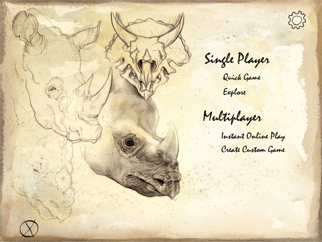
Evolution on main menu presentation. The idea is there are three main branches from the landing page: single player, multiplayer, and "account". Collections and achievements are hidden behind the "account" link (clicking the player avatar in the top left corner takes you to a more detailed fullscreen account page with links to your collections). Technically, a fourth link from this page is "settings", tucked away as an icon in the corner. Transition animations between screens would simulate a flurry of pages turning.

Here's a playtable showing phase ladder (upper left corner) with a compass icon that turns for each of the four phases, along with food bank icon (inner upper right) and dino meeple turn indicator (lower left). For the player names, I'm using the same font we use for the rules folder (Almagro).

Finally, a style guide to codify everything we’ve learned so far, created as a handoff to bring the production art director up to speed as I wrapped the prototype project.